Karü
Creating a visual identity, brand guideline, and marketing e-commerce site for an artisanal crafts business based in Auckland, New Zealand.
UI design, Graphic design, Brand strategist, Marketing
Figma, Illustrator, Shopify, Meta, WIX, Google Suite.

Expand Table of Contents
Overview permalink
Karü (previously Eden) is an artisanal crafts business selling products such as sterling silver jewellery and other hand-crafted goods.
I worked on designing their visual brand identity, creating an initial design system on Figma and their E-commerce store which would be on Shopify.
Key Objectives permalink
Project objectives were defined as:
- Create a respectable visual identity, suitable for a variety of applications, both online and offline.
- Create a design system; using Figma to create a simple UI component library and design sections.
- Design a professional E-com website to present Karu's products, demonstrate credibility, and sell.
Visual Identity permalink
Designing the visual identity consisted of various steps, one of them being creating a colour palette. For the palette I chose colours inspired by nature with a similar likeness to the brand colour (Green).
Using nature and forest inspired colours fit the brand well. This was the initial palette; later on I upgraded the scale and detail of the palette taking UI Components, and accessibility more into consideration.

Logo permalink
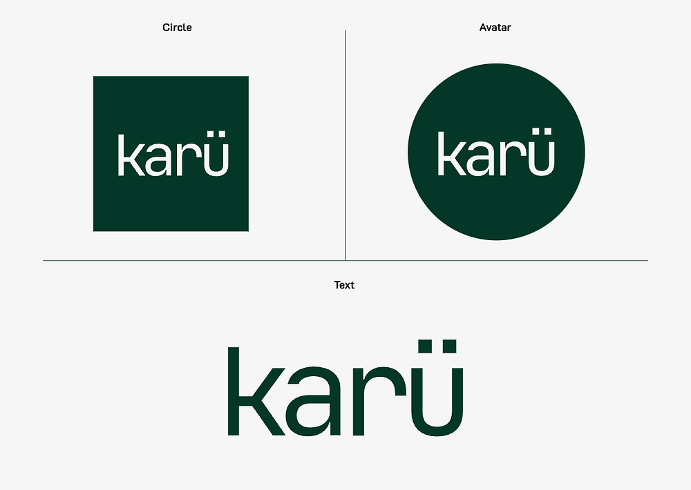
Icon: Represents unity. I took inspiration from the various native indigenous Mapuche symbols and created my own design that incorporated symbolism of community, unity, and family. Below you'll see some logo configurations and a simple GIF animation.
Font: JetBrains Mono (Bold).
Karü translates to 'green' in Mapudungun, the primary language of the Mapuche.


I settled on Source Sans Pro for the lead typeface. Primarily for it’s flexibility in weights and styles, but also for it’s familiarity. It was ideal for our needs. Source Code Pro is used sparingly, as the secondary typeface.

Style Guide permalink
Here is the simple yet effective type-scale I created for Source Pro Sans. Taking multiple devices into consideration.

Below is the upgraded colour library, with each colour being made into a variable in Figma. It includes all the brand colours, gradients, shadows, states, and neutral colours. As for the iconography I ended up using the Material Design icon library primarily for its recognisability. With its extensive collection of universally understood symbols, it ensures clarity and consistency in communication, enhancing user experience across platforms and applications.


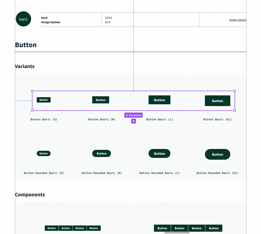
I was inspired by various well known Design Systems (especially Goldman Sachs) who publicise their UI kits to craft Karü's own UI Component Library (although to a much smaller scale, considering the time constraints). It's a Style Guide with a few UI Components, so it's not to be considered a Design System. I created variants for Hover, States, and Status of the buttons.


E-com concepts permalink
The store is planned to be designed on Shopify (a custom theme developed with Shopify liquid). Wireframes, Mockups were designed on Figma. Below is one of the early mockups for the store.


Packaging permalink


Full case study coming soon
Including web and mobile prototypes created on Figma, showcasing the live store, Key learnings, SEO research and set-up, Social media strategies, design and copywriting of emails.
